Do you know how popular your name was when you were born? Most people have only a vague sense of it. They may recall that their name felt ordinary in their class, or that they were the only one who had it, or that they tend to meet the name mostly among people either much older or much younger than they are.
This vague sense can be replaced with a more precise quantitative answer. The U.S. Social Security Administration has kept a record of the first names on Social Security card applications going back to 1880, and it publishes number of babies born with a given name for each sex in each year. If at least 5 babies were born with your name in a given year, then somewhere in that file is your name, and from this data we can determine when your name was most popular and whether it is currently increasing or decreasing in popularity.
This book is about turning questions like this into answers. The tools involved are a programming language, statistical methods, and ways to think about evidence. These are the skills we aim to develop over the course of this book.
1.1 A first look at a data science analysis
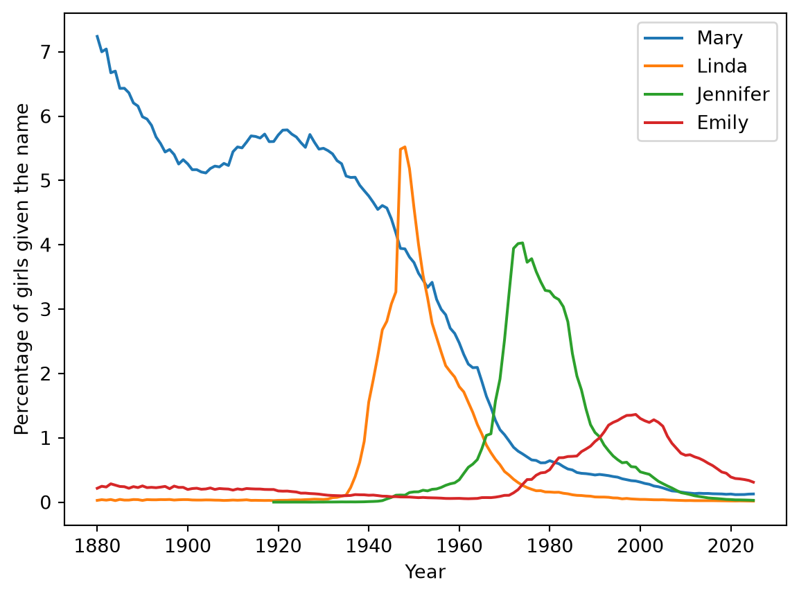
Before defining what the field of Data Science is, it is useful to see what a small analysis typical of a Data Science project looks like. The code below loads the baby-name data, which covers every name given to at least five babies in a year, and plots the popularity of four female names over time.
You are not expected to understand this code. It is here so you know what you are working toward. Its pieces arrive over the next several chapters: Chapter 3 teaches the plotting, Chapter 5 teaches how to load a file and pull out the rows for one name, and Chapter 8 covers the for line that repeats the work for each name.
import pandas as pd# One row per name, per year, per sex, for every name given to at least# five babies in a year, from 1880 to 2025names = pd.read_csv("https://raw.githubusercontent.com/emeyers/intro_datascience/main/data/babynames/baby_names_all.csv.gz")names.head()
year
name
sex
count
percent
0
1880
John
boy
9655
8.154630
1
1880
William
boy
9532
8.050744
2
1880
James
boy
5927
5.005954
3
1880
Charles
boy
5348
4.516930
4
1880
George
boy
5126
4.329428
As a first step in any analysis, it is important to understand the data one is working with. For the baby-names data, each row corresponds to one name, in one year, for one sex. The count column gives the number of babies who received that name, and the percent column expresses that count as a percentage of all babies of that sex born in that year. The first row therefore says that 9,655 boys born in 1880 were named John, and that those boys made up 8.15463% of all the boys born that year.
With the contents of the file established, we can plot how the popularity of individual names has changed over time:
import matplotlib.pyplot as pltgirls = names[names["sex"] =="girl"]for name in ["Mary", "Linda", "Jennifer", "Emily"]: one_name = girls[girls["name"] == name] plt.plot(one_name["year"], one_name["percent"], label=name)plt.xlabel("Year")plt.ylabel("Percentage of girls given the name")plt.legend()plt.show()
Each of these four names dominated a different era. Mary was the most common girls’ name in the United States in 76 of the 82 years from 1880 to 1961, and in 1880 it was given to 7.2% of girls. Jennifer reached its peak in 1974, at 4.0%, and Emily reached its own in 1999, at 1.4%.
The trajectory of Linda is the most abrupt of the four. In 1946 the name was given to 3.3% of American girls, and in 1947 that figure jumped to 5.5%. Names rarely move that quickly, and 1947 happens to be the year in which Buddy Clark’s recording of a song called “Linda”, with Ray Noble’s orchestra, reached number one on Billboard’s airplay chart.1
It is worth being precise about what that last sentence establishes and what it does not. The data establishes the timing of the increase. The song is an explanation brought to the data from outside it, by someone who already knew that popular music influences what parents name their children. The explanation is plausible, but a file of names and counts cannot confirm it. Distinguishing between what the data shows and what we have supplied ourselves is a skill this book returns to repeatedly.
A second pattern in the plot is easier to overlook: the peaks grow steadily shorter over time. In 1880 the most common girls’ name was given to 7.2% of girls, whereas in 2025 the most common name, Olivia, was given to only 0.8%. Parents did not stop having favorites, but the pool of names they choose from has grown enormously. This represents a genuine change in American naming practices, and it emerged from nothing more than a file of names and counts.
The analysis is worth noting for two reasons. It answered a question that intuition alone could not, and it revealed a pattern that nobody had set out to look for.
1.2 What is data science?
Data science is the practice of using computation and statistical reasoning to answer questions with data. In practice it draws on three things: enough programming to transform data into a useable format, enough statistics to know which conclusions the data supports, and enough subject area knowodlge to ask a question worth asking and to recognize a wrong answer when one appears.
The last of these three is the one most easily underrated. Nothing in the baby-names code knows what a name is or what it means for one to be fashionable. The code established that the name Linda rose sharply in 1947, but the connection to a popular song came from a person who already knew that music influences naming and who went looking for such an explanation. An analysis that ignores the subject matter it concerns tends to produce results that are technically correct and of little use to anyone.
1.2.1 From statistics to data science
The practice of analyzing data is centuries old, but the name “data science” is very recent. Governments have counted people and harvests for as long as they have collected taxes, and the word “statistics” still carries that origin, since it began as a term for the description of a state’s resources. The field became mathematical when probability was brought to bear on it, and the version of it taught today was largely built between 1885 and 1940 by people working on concrete problems: Francis Galton studying biologically inherited traits, William Gosset drawing conclusions from the small samples a Guinness brewery could actually run, and Ronald Fisher spending fourteen years on agricultural field trials. Several of these ideas created by these early statisticians have chapters of their own later in this book, starting with Chapter 9.
In all the research areas where these classic statistical methods were developed, data was expensive, slow to obtain, and scarce. For example, Fisher’s field trials took a growing season each to generate data and Gosset’s samples were limited to what a brewery could brew and taste. When you hold only a few dozen observations, assumptions about the process that produced them are what make any conclusion possible, so the mathematics was doing work the data could not do on its own. Statistical theory grew up as a way of extracting the most from scarce data.
The first sustained objection to classical statistical analyses came from inside the field, when John Tukey opened “The Future of Data Analysis” in 1962 by admitting doubt about his own subject and arguing that the real activity, which he called data analysis, is a science in its own right of which mathematical statistics forms only one part (Tukey 1962). The argument was repeated over the following decades, by William Cleveland in 2001 under the name data science (Cleveland 2001) and by Leo Breiman the same year, who described a field split between people who build probability models of how data arose and people who judge an algorithm purely by how accurately it predicts (Breiman 2001). What eventually settled the question was not the arguments but the arrival of cheap computing (Donoho 2017).
1.2.2 New approaches to analyzing data
When data and computing power became abundant around the turn of the 21st century, data analysis drastically changed in many fields. Records that once had to be gathered deliberately began accumulating as a byproduct of ordinary activity, whether a purchase, a search, a card application, or a sensor reading, and the internet turned the resulting files into something a stranger can download in seconds. At the same time, programming languages made analysis something you could carry out without deriving it first. The baby-name data at the start of this chapter shows both. Nobody ran a study to produce it, the records exist because people applied for Social Security cards, and retrieving all 2,181,032 rows took a single line of code.
This rise in larger data also changed which skills were needed. In Fisher’s era the limiting factor was the data itself, and mathematics allowed one to understand larger patterns from this limited data. In the past couple decades, data is frequently abundant but disorganized, arriving in the wrong shape, spread across several files, full of missing entries and inconsistent spellings. The skill that allows one to handle this constraint is programming: finding a file, reshaping it, drawing it, and running the whole process again unchanged when the file is updated next year. This is why the early chapters of this book are about Python rather than probability.
The rise of large data sets also frequently changes how much of the older theory you need. Much of classical statistics answers one question: given a small sample, how confident can I be that the pattern I see is not an accident of which few individuals happened to end up in my study? That question is pressing when you have thirty observations. It is much less pressing when you have two million. Nobody needs a significance test to establish that the name Linda rose in 1947, because the rise is enormous, the records run to millions of births a year, and you can see it in the plot. With data of that size the hard part moves elsewhere, to getting the data into a usable shape and then seeing what is in it. That is why this book spends whole chapters on reshaping data (Chapter 5) and on visualization (Chapter 6) before it takes up inference at all.
Programming also opened a genuinely different way of analyzing data, known as machine learning: instead of writing down a mathematical model of how the data arose, you let an algorithm search for patterns that predict well. The obvious worry is that an algorithm flexible enough to find any pattern will find ones that are not really there. The answer is not a proof but a simple procedure. You hide part of your data, let the algorithm learn from the rest, and then check its predictions against the part it never saw. If it does well on data it has not seen, the pattern it found is likely real. Repeating this with different parts held back each time is called cross-validation, and Section 10.1 builds one.
The same instinct applies when you do need to answer a question about chance, and it replaces mathematical theory with repetition. Suppose you find that girls in some dataset score two points higher than boys, and you want to know whether a gap that big could show up by chance alone. Classical statistics would answer with a formula derived under assumptions about the population. You can instead answer it by brute force: shuffle the labels so that “girl” and “boy” are assigned to the scores at random, recompute the gap, and repeat several thousand times. If a gap of two points almost never appears in the shuffled versions, chance alone is a poor explanation of the real one. This is a permutation test, and it needs no formula, only a computer willing to repeat something ten thousand times. Section 9.3 builds these tests directly.
None of this makes statistical reasoning optional, and the book teaches both. What has changed is the order in which they become useful: you now have to get the data and look at it before there is anything to reason about.
1.2.3 The rise of data science
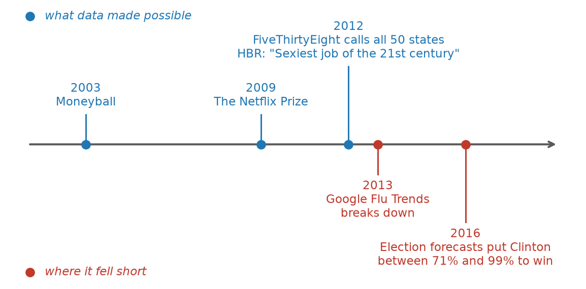
The changes described so far were mostly visible to the people already doing the work. What gave data science a public profile, along with job titles and degree programs, was a series of high-profile events over the first two decades of the 21st century. The episodes below are the ones that come up most often, and they shaped both the enthusiasm for the field and the criticism of it.
One event that had a signifant impact showing the value of these new data analysis methods occured in Major League Baseball. In 2002 the Oakland Athletics, working with one of the smallest payrolls in baseball, used statistical analysis of ordinary published numbers to find players the scouting system had undervalued, and put together a season that included a twenty-game winning streak. Michael Lewis’s 2003 book about it, Moneyball, reached an audience far beyond baseball (Lewis 2003) and led most major league baseball teams to invest in increasinly larger analytics departments. Another event that drew attention to using machine learning for analyzing data occurred in 2006 when Netflix offered a million dollar prize to anyone who could improve the company’s recommendations by 10%, along with a large dataset of ratings so that anyone could try, and in 2009 a team assembled from outsiders beat what Netflix’s own engineers had managed. And a third source that showed the public the power of data analysis was due to Nate Silver’s statistical models at FiveThirtyEight website, where predicted 49 of 50 states in the 2008 presidential election and all 50 in 2012, at a time when television coverage ran on the intuition of experienced commentators. By 2012 a Harvard Business Review article called the data scientist “the sexiest job of the 21st century” (Davenport and Patil 2012), and universities began launching degrees and renaming departments to match.
As the field begain to mature, failures and negative consequences began to become visible. Netflix never put the winning algorithm into production, because it averaged together so many separate models that it was expensive to run and hard to maintain, and researchers then showed that individuals could be identified in the supposedly anonymous ratings by matching them against public reviews on another film site (Narayanan and Shmatikov 2008). Google Flu Trends estimated influenza activity from the volume of flu-related searches, faster than the Centers for Disease Control could report it, and was held up as proof that with enough data careful modeling mattered less than sheer scale. Its estimates then drifted, reaching roughly double the true rate of flu-related doctor visits by 2013, in part because the model had been fitted years earlier and never refitted while the world changed underneath it (Lazer et al. 2014). In 2016 Cathy O’Neil’s Weapons of Math Destruction documented models used in sentencing, hiring, lending, and school evaluation that encoded existing inequities and applied them at scale (O’Neil 2016), and ProPublica’s investigation of the COMPAS recidivism model found that Black defendants were roughly twice as likely as white defendants to be wrongly flagged as high risk. That same year produced the sharpest argument about forecasting. FiveThirtyEight gave Donald Trump roughly a 29% chance of winning, and was the most cautious of the major forecasters by a wide margin. The Upshot, at the New York Times, put Clinton’s chances at 85%, HuffPost at 98%, and Sam Wang’s Princeton Election Consortium at 99%. Trump won, and forecasting was widely described as having failed. Two separate questions came out of that. The first is whether a 29% forecast of something that then happens is a failure at all, which is a real question with a real answer, and Chapter 9 takes it up. The second is why forecasters looking at substantially the same polls disagreed by nearly thirty percentage points about how certain the result was. The models differed less in what they knew than in how they handled the chance that the polls were wrong everywhere in the same direction at once, which is exactly what happened.
The job title has since stopped being exotic and settled into an ordinary role in most industries, and attention to the potential harms became a standard part of the work rather than an afterthought. The most recent wave of attention has moved to large language models, which Chapter 12 takes up at the end of the book.
1.2.4 How data scientists and statisticians approach problems
The rise of data science did not displace statistics. Both fields are active, both are still developing new methods, and a great deal of what a data scientist does on an ordinary day was invented by statisticians. So how do members of the two communities differ?
The difference is one of instinct more than of subject matter. A statistician’s instinct is to fit a mathematical (probability) model to the data and draw conclusions based on properties of the model. A data scientist’s instinct is to try several approaches and see which one gives the most accurate predictions and most valuable practical insights (often this involves fitting the method on most of the data, then checking its predictions against a subset of data deliberately kept aside). One camp says the proof is in the math; the other says the proof is in the pudding (i.e., do the results give practical insights). Both instincts are correct, and both fail in characteristic ways when used alone.
The boundary between the two is not a sharp one, and most practitioners move back and forth across it depending on the problem in front of them. The table below summarizes where the two emphases typically differ.
Table 1.1: Two emphases in the analysis of data
Statistics
Data science
Where the data comes from
Often collected deliberately, to answer a specific question
Often collected for some other purpose, and reused
Typical size
Small enough to handle by hand or with a single command
Often large enough that retrieving it is part of the problem
Why a method is trusted
It has mathematical guarantees under stated assumptions
It performs well when tested against data it has not seen
How much programming
Sometimes little
Usually substantial
What comes out
An estimate, an interval, a test result
Any of those, plus predictions, visualizations, and working systems
1.2.5 What data cannot do
Two cautions belong at the beginning of a book like this rather than at the end.
The first is that data is a record of the world that produced it, and that record includes the world’s mistakes. A model trained on past hiring decisions learns the decisions that were actually made, biases included, and applying such a model at scale can spread those biases far faster than any individual could.
The second is that a pattern in data is not, by itself, evidence of a cause. We encountered this a few pages ago, when the plot showed the name Linda rising sharply in 1947 and the song was offered as an explanation from outside the data. The fact that two things move together does not establish that one of them produces the other, and separating these two possibilities accounts for much of the work involved in interpreting a result honestly.
Both problems recur throughout this book, because both are ordinary features of working with data rather than rare special cases.
TipExercise
Find a recent news article whose central claim rests on data. Write down three things:
The question the analysis was trying to answer.
Where the data came from, and who collected it.
One thing the data cannot tell you, even if the analysis is done perfectly.
NoteSolution
There is no single correct answer here, but a good one is specific. As an example, consider an article reporting that a city’s new bike lanes were followed by a drop in cycling injuries.
The question. Did adding bike lanes reduce injuries to cyclists?
The data. Police accident reports, collected by the city for administrative purposes rather than for this analysis. Injuries that were never reported to police are not in the data at all.
What it cannot tell you. Whether the bike lanes caused the drop. Injuries might have fallen because fewer people cycled that year, because the weather was worse, or because a different safety campaign ran at the same time. The data records what happened, not what would have happened otherwise.
Point 3 is the one worth practicing. Most weak data journalism is weak because a change over time is presented as an effect of one particular cause.
1.3 What a data science project looks like
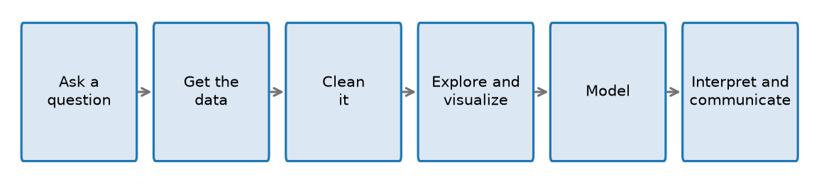
Projects vary, but most of them pass through the same stages.
Five of these stages are reasonably self-explanatory. Modeling is the exception, and it deserves a definition: modeling means fitting a rule to the data, either in order to summarize a pattern compactly or in order to predict a value that has not been observed. Determining whether a fitted rule means anything at all is a large part of what the second half of this book is concerned with.
The chapters of the book follow these stages in order:
Two chapters sit outside this table because they supply tools used at every stage. Chapter 2 teaches enough Python to write any of the code at all, and Chapter 8 introduces loops and user-defined functions, which are the tools for repeating an analysis and packaging it up for reuse.
The arrows in the diagram run in only one direction, which is a simplification of how the work actually proceeds. Exploring the data frequently reveals that different data is required, or that the question one began with was the wrong question to ask. Cleaning is rarely finished on the first attempt. In practice, most projects pass through this sequence of stages more than once.
1.4 Writing analyses others can check
An analysis is best understood as an argument, and like any argument it is worth only as much as a reader’s ability to check it. A result presented without the steps that produced it asks to be taken on faith.
Meeting that standard is harder than it sounds. Over the past decade, researchers across many fields have tried to reproduce published findings and repeatedly failed, sometimes because the original work was wrong and often because the description of what was done was not detailed enough to repeat. This came to be called the replication crisis. A written summary of an analysis leaves out exactly the details that matter: which rows were dropped, and which version of the data was used.
Donald Knuth proposed a fix for a related problem in the 1980s. He argued that programs should be written to be read by people, with the explanation and the code composed together as a single document (Knuth 1984). He called this literate programming. Applied to data analysis, the idea is that the writing, the code, and the results belong in one document, so that a reader can follow the reasoning and see precisely what produced each number.
Several tools put this idea into practice, differing mainly in which programming languages they support and in how a finished document is shared. The one most widely used with Python is the Jupyter notebook, and it is the one this book uses.
1.4.1 Jupyter notebooks
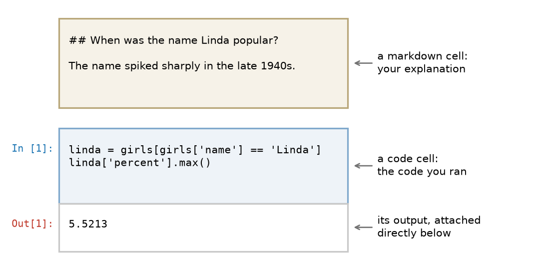
A Jupyter notebook is a document built on the idea of literate programming and reproducible analyses. It consists of a sequence of cells of two kinds. Markdown cells hold text, which is where the explanation, the reasoning, the headings, and any equations belong, while code cells hold the code itself. When a code cell is run, its output appears directly beneath it and remains there as part of the document.
Markdown is a plain-text way of marking up formatting. You type ## A heading to get a heading and **important** to get bold, and the notebook renders it when you run the cell. The markdown cell in the diagram below shows what you type rather than how it looks once rendered.
The number in brackets beside a code cell is its execution count. The first cell run in a session is labeled [1], the next [2], and so on. The count records the order in which the cells were actually executed, which is not necessarily the order in which they appear on the page. This number is worth keeping in mind, because the next section concerns what happens when those two orders disagree.
To run a cell, click on it and press Command+Return on a Mac, or Shift+Enter if you are using a Windows computer. You can return to a cell, change it, and run it again as often as you like. That freedom to revise is what makes a notebook well suited to exploring data, and it is also the source of one difficulty that you should understand before encountering it.
1.4.2 The order cells run in
A notebook keeps a running memory of everything you have executed. This memory is called the kernel: the Python session sitting behind the notebook. If you define a variable in one cell and run it, that variable exists in the kernel from then on, no matter where the cell sits on the page or whether you later delete it.
This means a notebook that works perfectly for you can fail for anyone else. Suppose you write a cell, run it, then scroll up and edit an earlier cell without re-running the ones below. The notebook on your screen is now telling a story that its own code no longer produces. A reader who opens it and runs the cells from top to bottom gets different results, or an error.
The execution counts are what allow you to detect this situation. If you scroll through a notebook and the brackets read [1], [7], [2], then the cells were not run in the order in which they are written, and the results displayed cannot be trusted.
There is a simple habit that prevents the problem. Before sharing a notebook or submitting one, restart the kernel and run every cell from the top. In JupyterLab this option is Kernel → Restart Kernel and Run All Cells, while other notebook tools call it Restart & Run All. Doing so clears the kernel’s memory and runs everything in order, exactly as a new reader would. If the notebook produces the same results after that, then it says what it appears to say.
This book is itself written this way, using a system called Quarto that applies the same idea to books. Every figure in these pages was produced by running the code you can see, at the moment the book was last built, and every number quoted in the text was checked against that code. When the chapter says Linda jumped to 5.5% in 1947, that number came out of the data file rather than out of the author’s memory.
TipExercise
A student writes three cells and runs them from top to bottom:
prices = [3.10, 3.25, 3.40]
average =sum(prices) /len(prices)
print(average)
The third cell prints 3.25. The student then goes back and edits the first cell to read prices = [3.10, 3.25, 3.40, 4.00], runs only that first cell, and runs the third cell again.
What does the third cell print now? What would a reader see if they opened the notebook fresh and ran all three cells in order?
NoteSolution
The third cell still prints 3.25.
Editing and re-running the first cell changed prices, but average was never recomputed. The second cell has not run since the edit, so average still holds the value calculated from the original three prices.
A reader who opened the notebook fresh and ran all three cells in order would see 3.4375, the average of the four prices. The student’s notebook shows one number on screen while its code produces another. Restart & Run All would have caught this immediately.
1.5 Building on the work of others
Almost nobody writes a data analysis entirely from scratch. The plot at the start of this chapter took a dozen lines of code, and every one of those lines rested on work done by other people: reading a file in a standard format, holding a table in memory, choosing where to place the axis ticks, and deciding how to draw a line. Written from nothing, that plot would have been a substantial programming project.
All of this is available because Python code can be packaged and shared. Three terms are easy to confuse and are worth separating:
A script is code written to do one task, run start to finish. Downloading a set of files is a good use for a script.
A module is a file of code meant to be reused, loaded by other code rather than run on its own.
A package, also called a library, is a collection of related modules distributed together.
Loading a package into your own code is called importing it, and it looks like this:
import pandas as pd
That line makes the pandas package available and gives it the short name pd, so that later code can write pd.read_csv(...) instead of the full name. Chapter 2 covers how this works. For now the point is only that the line exists, and that most of what this book does follows from it.
Python is not the only language used for this work. R is the other common choice, and it is well suited to statistics and to producing reports. Python’s advantage is that it is a general-purpose programming language that also has strong data packages, so the same language that loads your data can run a website or control an instrument. Either language is a good place to start, and people who do this professionally often use both.
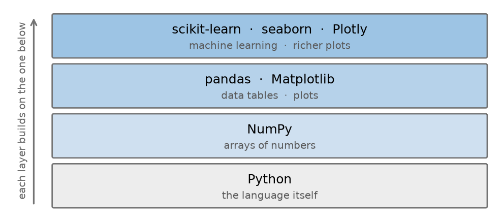
These packages are layered on one another rather than independent. NumPy provides the array of numbers that nearly everything else stores its data in; pandas builds tables on top of NumPy arrays; scikit-learn expects its input as arrays or tables.
Every package in that table is free and open source, written and maintained by communities of contributors. These packages also change over time. New versions add features, occasionally rename existing ones, and sometimes break code that previously worked. This is the reason a careful analysis records which versions of each package it used, a point that Appendix A returns to.
1.5.2 Getting set up
Running the code in this book requires three things: Python itself, the packages listed above, and a way to run notebooks. Installing them is a one-time task, and it is the part of learning data science most likely to be frustrating for reasons that have nothing to do with data science.
Appendix A walks through it with a tool called uv, and also covers the two alternatives you will run into in other courses and workplaces, pip with venv and conda. If you cannot install software on the computer you are using, it covers running notebooks in a browser instead, which requires installing nothing.
Once you have a notebook you can run, the exercise below confirms that everything is connected properly.
TipExercise
Open a Jupyter notebook and run the following two lines in a code cell:
import pandas as pdprint(pd.__version__)
If a version number prints, pandas is installed and your setup works. If you get a ModuleNotFoundError instead, the package is not available in the environment your notebook is using. An environment is the particular Python installation and set of packages your notebook is connected to, and Appendix A explains both what that means and how to fix it.
NoteSolution
import pandas as pdprint(pd.__version__)
3.0.5
Your version number will almost certainly differ from the one shown here, and that is fine. What matters is that a number printed at all.
1.6 How to use this book
This book assumes no programming experience and no mathematics beyond arithmetic. You need a computer you can install software on, or failing that, an internet connection and a browser.
Type the code out rather than simply reading it. Programming is a skill that resembles playing an instrument more than it resembles learning a set of facts, and it does not transfer from the page merely by being understood. Once a piece of code runs, change it and see what happens: plot a different name, or break something deliberately and read the error message that results.
Most sections end with an exercise, and every exercise has a solution you can expand. Try the exercise before opening the solution. The difficulty of a problem you have not attempted is impossible to judge, and reading a worked solution produces a feeling of understanding that is not the same thing as understanding.
The chapters are meant to be read in order: later chapters use the tools introduced earlier, and nothing is used before it is taught.
1.7 Summary
Data science uses computation and statistical reasoning to answer questions with data. Knowledge of the subject the data is about is part of the job, not an optional extra.
It overlaps heavily with statistics. The differences are of emphasis: where the data comes from, how much programming is involved, and whether a method is trusted because of a mathematical guarantee or because it performs well on data it has not seen.
Because data records a world that contains its own biases, a model built on that data can reproduce and spread them. A pattern is also not a cause.
The field became publicly visible through a series of episodes, some of which showed what analyzing data made possible and some of which showed how it fails. Both halves matter.
Most projects move through the same stages: ask a question, get the data, clean it, explore and visualize, model, then interpret and communicate. Expect to go around that loop more than once.
Literate programming is the practice of writing explanation and code together in one document. Jupyter notebooks apply it to data analysis, mixing markdown cells, code cells, and the output of that code.
Because a notebook’s kernel remembers everything it has run, cells run out of order can make a notebook show results its own code no longer produces. Restart the kernel and run all cells before sharing one.
A package is a collection of reusable code that someone else wrote and shared. Analyses are built on layers of them, and this book uses Matplotlib, NumPy, pandas, scikit-learn, and several others.
1.8 Exercises
TipExercise
Return to the code at the start of this chapter and plot your own first name, or the name of someone you know.
Change the list of names in the for line to the name you want, and change "girl" to "boy" if appropriate. Then read off the plot: in what year was the name most popular, and roughly what percentage of babies received it that year?
One limitation of the data to be aware of: the records stop in 2025, and a name given to fewer than five babies in a year is withheld to protect privacy, so a very rare name may not appear at all.
NoteSolution
Only two strings in the original cell need to change. Using “Ethan” as the example:
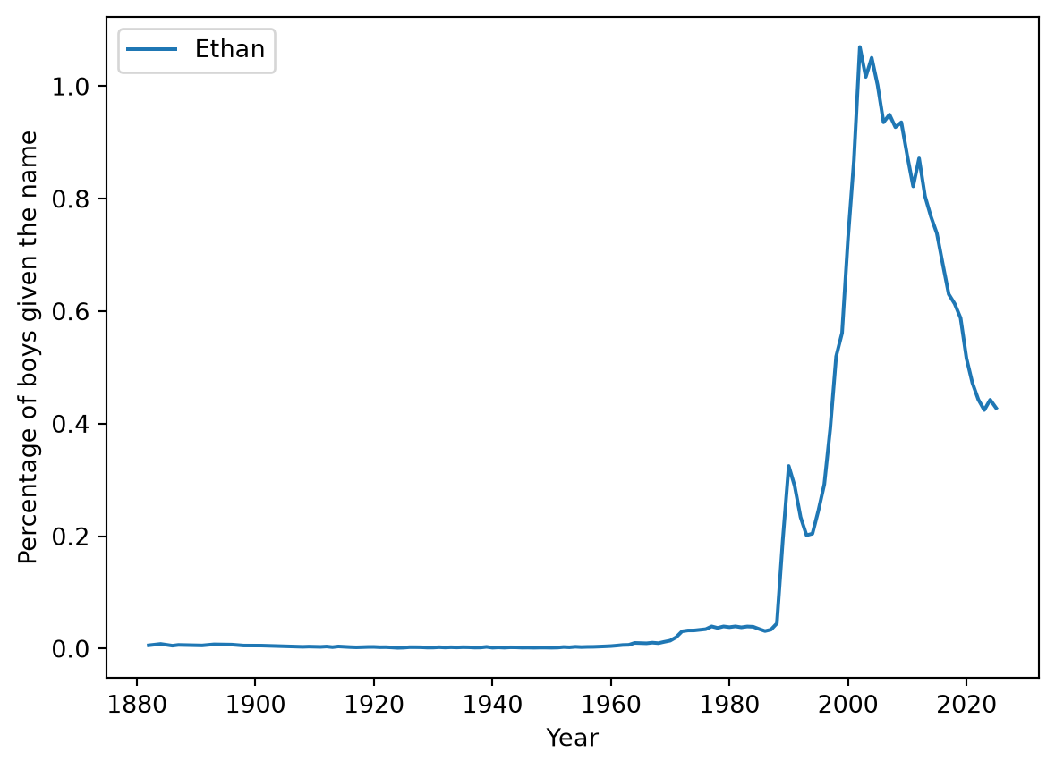
boys = names[names["sex"] =="boy"]for name in ["Ethan"]: one_name = boys[boys["name"] == name] plt.plot(one_name["year"], one_name["percent"], label=name)plt.xlabel("Year")plt.ylabel("Percentage of boys given the name")plt.legend()plt.show()
The name sits close to zero for a century and then climbs sharply from the late 1980s, peaking a little above 1% shortly after 2000. Reading that off the plot is all the exercise asked for.
If you want the exact figures rather than an eyeballed estimate, pandas can find them. You are not expected to write this yet; the tools appear in Chapter 5.
The peak is 2002, when 1.07% of boys were given the name. Compare that with Mary’s 7.2% in 1880: even a name at the top of its popularity today reaches a small fraction of what a common name reached a century ago.
If nothing plots at all, the name is probably absent from the data because there were not five babies born with that name in a given year.
TipExercise
Pick a question you want answered, in any area you care about. Sketch how you would work through the six stages in Table 1.2.
For each stage, write one sentence. Be concrete about the second stage in particular: name the data you would need, and say whether you think it exists and who would have it.
NoteSolution
Answers will vary. As a worked example, take the question “are the buses on my route getting less reliable?”
Ask a question. Has the proportion of buses on route 12 arriving more than five minutes late increased over the past three years?
Get the data. Scheduled and actual arrival times per stop. Many transit agencies publish this; if mine does not, I would have to ask, or record arrivals myself for a period, which would give a much smaller and more limited dataset.
Clean it. Decide how to treat trips that were cancelled outright, stops that were skipped, and any period where the route itself was changed.
Explore and visualize. Plot the proportion of late arrivals by month over three years, and look at whether the pattern differs by time of day.
Model. Estimate the size of the change, and check whether a trend that size could plausibly be produced by chance variation alone.
Interpret and communicate. Write the result up with the plot, state what the data does not cover, and say plainly whether the change is large enough to matter to a rider.
The most common weak point in a sketch like this is stage 2. Questions that are easy to ask are frequently attached to data that nobody collected.
TipExercise
Some names fall out of favor gradually. Others fall off a cliff.
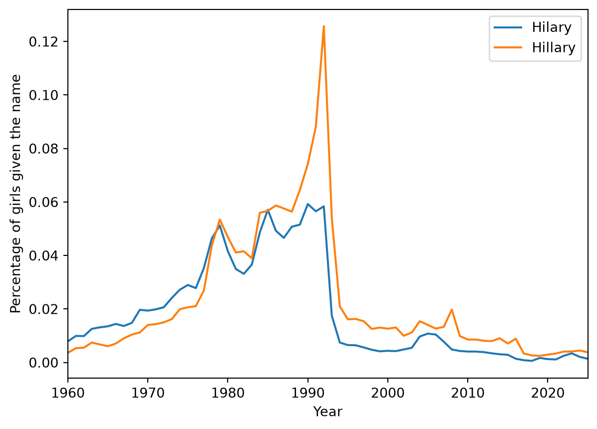
Using the plotting code from the start of this chapter, plot the girls’ names "Hilary" and "Hillary" together. Then answer three things:
In which year does each name collapse?
Which of the two spellings falls further, and is that the one you would have guessed?
What does the data establish about why it happened, and what would you have to bring from outside the data?
This example is due to the statistician Hilary Parker, whose 2013 analysis of it (Parker 2013) is one of the better-known pieces of writing about this dataset.
NoteSolution
girls = names[names["sex"] =="girl"]for name in ["Hilary", "Hillary"]: one_name = girls[girls["name"] == name] plt.plot(one_name["year"], one_name["percent"], label=name)plt.xlabel("Year")plt.ylabel("Percentage of girls given the name")plt.xlim(1960, 2025)plt.legend()plt.show()
Both collapse after 1992. From 1992 to 1993 the share of girls named Hilary fell by 70%, and Hillary by 57%. Neither has recovered in the thirty years since.
Hilary, the one-l spelling, falls further, which is the opposite of what most people guess. Hillary Clinton spells her name with two, and 1992 was the year her husband was elected president. The spelling that was not hers dropped the more sharply of the two. Notice also that Hillary rose through 1992, peaking in the election year itself, before collapsing the following year.
The data establishes the timing and nothing more. It shows two names falling together, immediately after a particular year, and it cannot tell you what parents were thinking. That a newly prominent public figure made the name feel like a statement rather than a name is an explanation brought to the data from outside it, in exactly the way the song “Linda” was earlier in this chapter. It is a good explanation, and the file of names and counts cannot confirm it.
Cleveland, William S. 2001. “Data Science: An Action Plan for Expanding the Technical Areas of the Field of Statistics.”International Statistical Review 69 (1): 21–26. https://doi.org/10.1111/j.1751-5823.2001.tb00477.x.
Davenport, Thomas H., and D. J. Patil. 2012. “Data Scientist: The Sexiest Job of the 21st Century.”Harvard Business Review 90 (10): 70–76.
Lazer, David, Ryan Kennedy, Gary King, and Alessandro Vespignani. 2014. “The Parable of Google Flu: Traps in Big Data Analysis.”Science 343 (6176): 1203–5. https://doi.org/10.1126/science.1248506.
Lewis, Michael. 2003. Moneyball: The Art of Winning an Unfair Game. W. W. Norton & Company.
Narayanan, Arvind, and Vitaly Shmatikov. 2008. “Robust de-Anonymization of Large Sparse Datasets.”2008 IEEE Symposium on Security and Privacy, 111–25. https://doi.org/10.1109/SP.2008.33.
O’Neil, Cathy. 2016. Weapons of Math Destruction: How Big Data Increases Inequality and Threatens Democracy. Crown.
Wattenberg, Martin. 2005. “Baby Names, Visualization, and Social Data Analysis.”Proceedings of the 2005 IEEE Symposium on Information Visualization (INFOVIS’05). https://doi.org/10.1109/INFOVIS.2005.7.
That Linda’s rise and fall is the sharpest in the entire dataset is a finding of David Taylor, who ranked names by dividing the height of each name’s popularity peak by its width, a measure he borrowed from analytical chemistry (Taylor 2014); Taylor in turn credits earlier work at FlowingData on the names that rose and fell fastest. Studying the Social Security name records for trends of this kind was popularized by Laura Wattenberg’s book The Baby Name Wizard and by the NameVoyager, the visualization built from the same data and described in Wattenberg (2005). The link between the song and the spike is not part of Taylor’s analysis; it comes from later popular coverage of it.↩︎